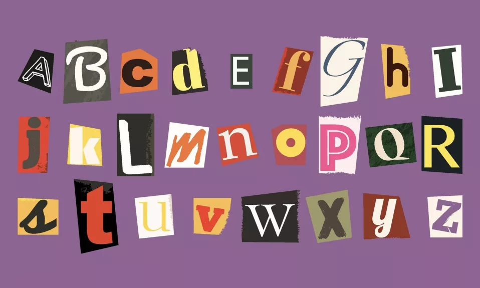
In this blog post, we will dive into the world of typography and how selecting the right font can vastly impact the success of your email marketing campaigns. From understanding the difference between serif and sans-serif fonts to finding the perfect match that aligns with your brand’s personality, our guide has got you covered.
The Serif vs. Sans-Serif Debate
Typography plays a crucial role in conveying your message effectively and professionally. When it comes to selecting a font for your email marketing strategy, one important decision is whether to choose a serif or sans-serif style.
- Serif fonts contain small decorative strokes at the end of letterforms (e.g., Times New Roman and Georgia). They are often considered more traditional and elegant, ideal for print materials like books and newspapers.
- Sans-serif fonts lack these embellishments and feature cleaner lines (e.g. Arial, Helvetica, and Verdana). Due to their increased legibility on screens, they are commonly used in digital content, such as websites and emails.
Selecting the appropriate font based on your target audience, tone, and intention can make all the difference in crafting an effective email campaign.
Creating Dynamic Pairings: The Art of Mixing Fonts
Using multiple fonts within your design can add depth and intrigue to your email layout. However, it’s essential to strike a balance between variety and consistency. To achieve this:
- Stick to a maximum of two or three different fonts so your content remains easy to read and digest for subscribers.
- Choose fonts that complement each other in terms of contrast, style, and weight. For example, pair a bold sans-serif font for headings with a lighter serif font for body text.
- Ensure your selected fonts align with your brand’s personality and message. If you’re promoting a trendy fashion line, opt for stylish, modern typefaces rather than traditional, formal ones.
An exciting combination can showcase your creativity and captivate your readers without compromising legibility or consistency.
Compatibility and Testing: Achieving Seamless Integration Across Devices
To ensure your carefully chosen fonts appear correctly on various devices and email clients, it is crucial to conduct thorough testing.
- Some fonts may not be compatible with specific email clients, which could lead to garbled or erroneous displays that detract from your content.
- Different devices (e.g., smartphones, tablets, laptops) may render fonts differently, impacting the overall layout and design of your email.
By utilizing email testing tools and previewing your emails on multiple devices, you can identify potential issues and optimize your content accordingly.
Top Font Recommendations for Email Marketing Success
While there are countless font options available, some stand out as particularly beneficial for email marketing endeavors. These include:
- Arial: A tried-and-true sans-serif font that boasts excellent readability on screens, making it an ideal choice for digital communications.
- Georgia: A highly legible serif font that adds an air of sophistication and elegance to your emails while maintaining optimal screen-readability.
When selecting the perfect font for your campaign, consider readability, consistency with your brand’s identity, and its utilization across all communications materials.
A Lasting Impression: Choosing the Right Font for Your Email Marketing Strategy
In conclusion, choosing the best font can significantly impact your email marketing success as it plays a crucial role in conveying your message effectively and professionally. A carefully selected, tested, and optimized font is the key to not only communicating your content clearly and consistently but also creating a lasting impression on subscribers that reflects your brand’s personality.
Remember to weigh the benefits of serif vs. sans-serif options, create dynamic yet consistent pairings, test compatibility across devices and clients, and search for fonts that align with your brand’s identity to maximize your email marketing potential.


